Business
Pros and Cons of Redesigning your Brand Logo

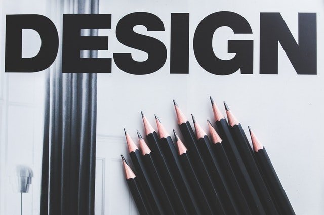
Photo by Kaboompics .com from Pexels
Redesigning your brand logo is a crucial business decision. Here are the pros and cons to consider.
Your logo is the emblem of your brand. It is a visual representation of what sets you apart from other businesses, especially your direct competitors. Consumers recognize your logo even before they see your name. And that automatic recognition triggers emotional and cognitive responses that, in the best-case scenario, lead to a purchase.
That’s why redesigning your brand logo is a decision that requires utmost thought and scrutiny. After all, the result can go either of two ways. The favorable outcome is your target audience embraces the change. The logo can even attract new adherents to your brand. The unfavorable consequence is you alienate your long-time supporters.
Coca-Cola is notorious for updating its logo, with the most recent redesign introduced in 2007. However, it’s important to note that Coca-Cola never does anything drastic to its existing design. The red becomes redder, for instance. And that’s it. That strategy works.
Another logo redesign success story worth mentioning is that of Starbucks. The brand zoomed in on its old logo. The resulting image became its new logo. It’s cleaner, more minimalist. Even without the brand’s name, it’s recognizable.
Before you decide whether to stick with your old logo or create something new, consider the latter’s pros and cons.
Pros
Reflects your brand’s growth
All businesses aspire to grow over time. And if your brand succeeded on that goal, now you’re not where you used to be. You’re far from where you started. And the world changed in the past years, too. A new logo can capture where you are now. It can also reflect how you respond to how the world turned out.
Improved flexibility
Ideally, your logo does not discriminate. It looks good on paper the same way it looks good on screen. Or it can easily be incorporated into novelty merchandise that needs branding. If that’s not the case, a redesign proves practical. You want to come up with something flexible without compromising brand consistency and aesthetics.
Fresher aesthetic
Speaking of aesthetics, if you feel like your old logo does not reflect the contemporary sense of style, a redesign might be in order. Even a minor update like Coca-Cola’s replacing a dull red with vivid red will result in a fresher look.
The potential to tap new market segments
You have gained control of your brand’s primary target market. Now you want to expand, tapping new market segments to boost sales. A logo update might work in your goal’s favor. For example, you’ll have the chance to be noticed by Gen Z who are now steadily gaining purchasing power.
Cons
While brands like Coca-Cola and Starbucks succeeded in their logo redesign, the same cannot be said for other brands’ attempts. Take, for instance, Gap. In 2010, the brand introduced a new logo in place of GAP in capital letters on a block of solid blue. The new logo was despised by many. The brand was quick to jump ship in favor of the old design.
The moral of the story is you do not introduce a new logo just because you feel like it. When it’s not broken, don’t fix it. If you do, be ready for these possible consequences.
Financial burden
Consider Gap’s rebranding effort that cost $100 million. All that has gone to waste. Yes, you can’t pull off a successful logo redesign without complementing it with even the slightest rebranding. And that requires investment.
Compromised brand recognition
Your customers know you from your logo. Think of it as your face. Going to a surgeon to tinker with your face puts you at risk of alienating your old friends, or customers, for that matter. They might pass you by on the streets without recognizing who you are.
Possible confusion among consumers
This is most true for brands that highlight their logo in all aspects of business operation, from designing stores to creating websites. Consider Apple changing its logo to something, well, un-Apple. The customers will have a hard time wrapping their heads around the change. That’s because familiarity, at least when it comes to consumer goods, breeds trust.
Loss of rapport built with customers
Your loyal customers feel like they know you. Your brand is part of their lifestyle. Your logo is a friendly face smiling at them from a billboard. You’ve built rapport with your customers by being consistent in the quality of your products and how you present your brand. A logo redesign breaks that consistency and can potentially compromise the rapport you’ve built with customers.
In Closing
From the get-go, design an inspired logo that speaks your brand’s truth and promise. Ideally, it’s something you can get behind for the long haul or even forever, if possible. You can’t go wrong with eye-catching prime labels. Just make sure all elements you incorporate into the design, from typography to colors, stay consistent with what your brand is about. A brand logo’s purpose is to attract attention. And if it’s also unforgettable, you’ve done an excellent job.
-

 Motivation5 years ago
4 Fun New Hobbies To Try This Year
-

 Quotes3 years ago
53 Motivational Gym Quotes to Fuel Your Workout
-

 Travel1 year ago
Why You Should Travel More: The Many Benefits of Seeing the World
-

 Quotes10 years ago
50 Most Powerful Quotes Ever Spoken
-

 Quotes4 months ago
100 Motivational Quotes to Inspire You in 2026
-

 Quotes2 years ago
43 Inspirational Quotes About Thoughts
-

 Quotes3 years ago
105 Motivational Quotes by Famous People
-

 Quotes9 months ago
100 Motivational Quotes to Start Your Day with Positivity


